

Fitted

UI case study - Career Foundry bootcamp project
Duration: 3 months part time
Role: Complete UI
Project summary
Fitted is a responsive web app that allows people to schedule, complete and track workouts with other aspects of their health. It has challenge and social features with the goal of keeping users motivated to continue using the app and focussing on their wellbeing.
Overview
People need a way to easily start and maintain healthy workout and lifestyle routines.
We will know this to be true when we see users regularly utilising the product and high levels of engagement in challenge/social features.
The problem:
User: Conveniently plan and execute workout routines
Business: Build customer base to later launch more premium features
Product: Launch MVP to iterate and gain metrics on best used features
Project Goals
Scope
Fitted is designed to encourage people who want to get into an easy routine for working out and keeping healthy. Finding exercise routines for your level can be difficult, especially if you want to try something new. This responsive web app aims to help people get into an exercise of their choice by providing routines, guides and interactive examples.
Context
Who?
People who are new or returning to fitness, want to find activities they like, and get into a good routine will be interested in Fitted.
Why?
To become healthy and enjoy the associated benefits (better mood, weight management, reduce risks of illness, learning something new)
Where?
As the web app aims to get users into a routine that suits them, the web app can be used whenever they like. They will use the web app while they are searching for, scheduling, and following routines.
What?
A responsive web app is best for Fitted, as users can search and view routines, guides, daily challenges, and other information on any device. They can also keep a schedule by adding sessions to their personal calendar.

Persona
Design process
Wireframes


Lo fi prototyope


Design iterations
User testing
I completed a round of user testing using my lo fi prototype in Figma. (Click to zoom)

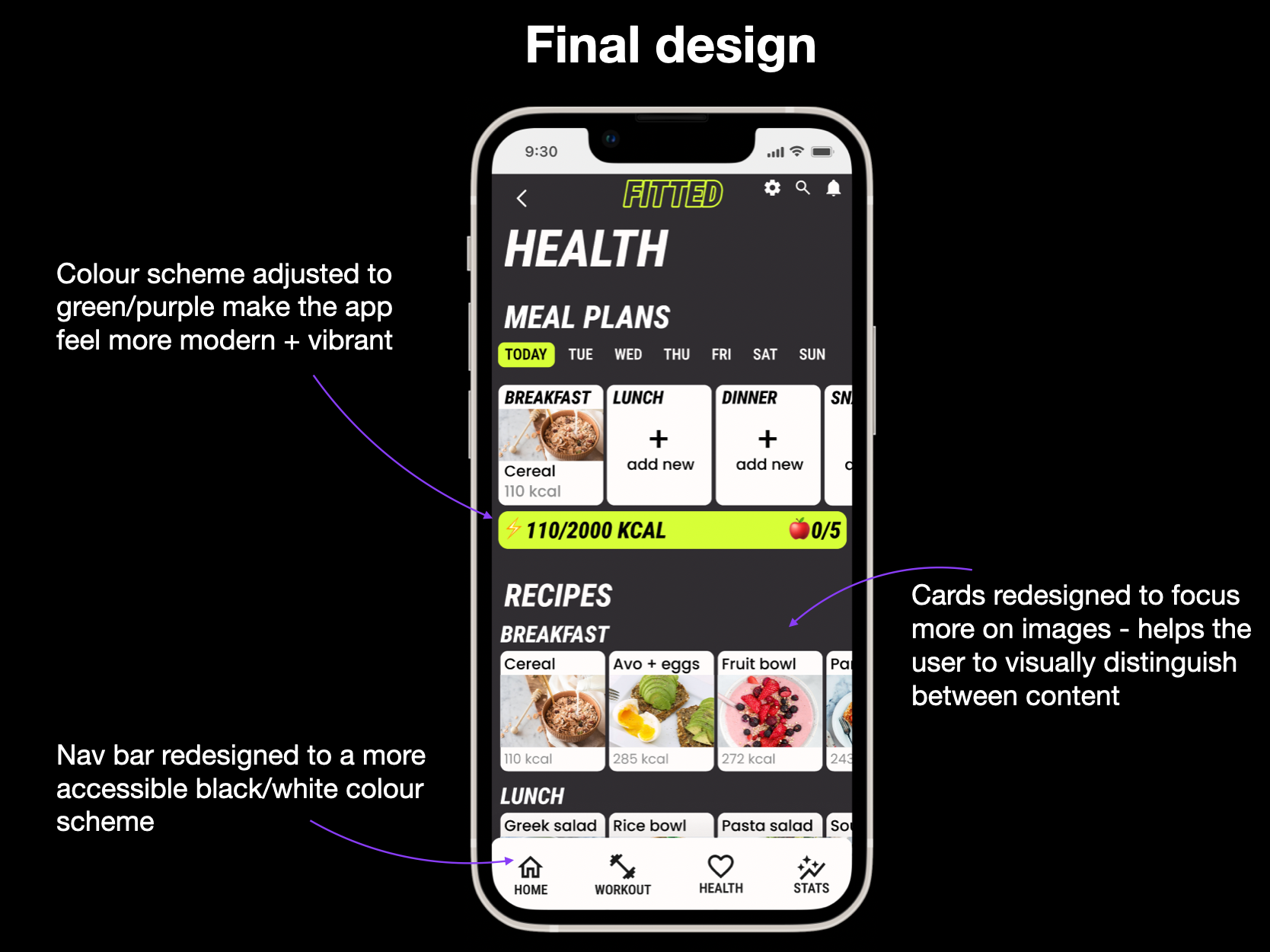
Workout page - active/disabled cards were added to the workout page to show the user which routine is available to start, including a tick visual as well as colour differences to increase accessibility for colour blind users.
Quickfire - Homepage design updated to show a carousel rather than a list view to save space
Recipes - cards were redesigned to be clearer with the focus being on images to help differentiate content
Key changes

Visual iterations
Design language


Breakpoints
Prototype

Workout flow

Navigation walkthrough
Overall learnings
Designing under constraints can be difficult but ultimately can lead to more creativity and usability.
Accessibility is extremely important and should be considered at every point throughout the design process.
Feedback and criticism are vital to improving as a designer.
Foundational research is invaluable to creating a well designed product.